
In the digital age, not only people but also devices generate more and more data. Whether it's a web server that logs accesses or different sensors that store measured values at regular intervals - the amount of data can very quickly become huge and confusing. However, this also increases the potential for gaining useful and important insights in order to optimize processes, plan for the future or identify failures.
Often, the speed at which these are gained plays a very important role. Machine learning (ML) helps us to cope with the flood of data. The format and type of data to be analyzed is critical in choosing which algorithms to use. In this blog post, we will focus on one method: time series analysis. We will look at approaches to detect anomalies or make predictions about the future, for example. Finally, we will list libraries and programming languages that can be used to implement such solutions.
What is a time series and how do you analyze it?
A time series is a collection of values, each of which refers to a specific time stamp. For example, a sensor that stores a measurement every 5 seconds along with the timestamp generates a time series. An ML algorithm normally treats each entry in its test set the same. In contrast, time series specify an explicit order through the time component. This is not strictly necessary for the algorithm, but one loses accuracy in the results if one ignores it.
If one wants to analyze a time series, there are some possibilities for it. For example, you can decompose it into different components to understand it better:
- Trend: In which direction does the average develop in the long term?
- Season: Is there a cyclical movement to be observed?
- Irregular component: These are outliers in the data set that may be explained by historical data or may simply represent "noise".
Splitting a time series is not mandatory if you are interested in making predictions about future trends. However, it can help to better understand the data as there are many algorithms to choose from. In the blog post introducing Machine Learning, it was already pointed out that Machine Learning is not a magic solution for everything. Certain models and algorithms are better suited for a certain type of data than others.
Some of the components into which you can decompose the time series (if you can) are very useful in making this choice. The following is a list of algorithms along with the type of time series they are well suited for:
- Trend is discernible, but not a season [1]
- Simple Moving Average Smoothing
- Simple Exponential Smoothing
- Holts Exponential Smoothing
- Trend and season are recognizable
Which tools can be used for the analyses?
Without going into too much detail, let's now look at a few examples that illustrate some of the concepts mentioned. For this, we will use a CSV file that represents statistics about collected news - about feeds that we visualize in our press review use case. The file has the following format:
day, docs 2016-08-29,144 2016-08-30,134 2016-08-31,134 2016-09-01,152 2016-09-02,170 … 2017-09-30,48 2017-10-01,50 2017-10-02,94
As you can see, each line consists of a date and a number representing the crawled messages for that day. For the visualizations and analysis we will use the R language. This language is open source and very popular for tasks around statistical analysis. It has a very large collection of algorithms already implemented and an active community. This allows us to demonstrate some of the methods mentioned with only a few lines of code. In these examples, we are concerned with the algorithms and their application to the number series, so we will focus on the number column docs (the temporal order is preserved by sorting by date) and settle for working with indexes (instead of dates) on the x-axis.
First, let's take a look at our data. We do that with the following code:
pslog <- read.csv('pslog.csv', header = T) plot.ts(pslog$docs)
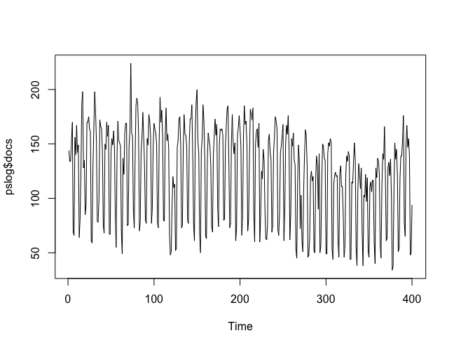
Figure 1: Visualization of the data
As you can see in Figure 1, the cycle of the data is very clear: It is a weekly cycle. The number of news items published is much lower on weekends than from Monday to Friday. We can see the trend, but the cyclical fluctuation masks it. However, we can make the decomposition of this trend into the described 3 components:
ps2 <- ts( pslog$docs, frequency = 7 ) dec <- stl( ps2, s.window = 'periodic' ) plot(dec)
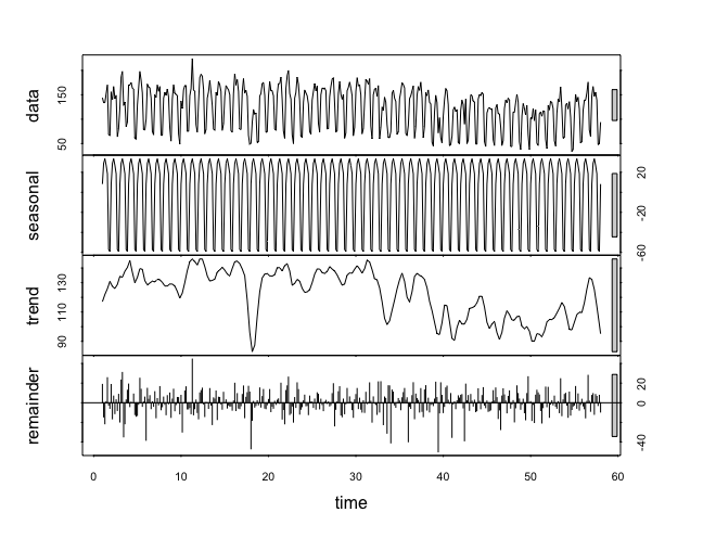
Figure 2: Decomposition of the time series
We created a variable from our data as a Time Series using the ts function and then decomposed it into its components using the (Seasonal Trend Decomposition) function. The trend was isolated as a graph, making it much easier to see than in the original data. Next, we now want to create a forecast over the next two weeks. For this we will use the Holt-Winters algorithm:
ps2fit <- HoltWinters( ps2 ) ps2fit.pred <- predict( ps2fit, 14, prediction.interval = T) plot.ts(ps2,xlim=c(30, 61)) lines(ps2fit$fitted[,1], col = 'green') lines(ps2fit.pred[,1], col = 'blue') lines(ps2fit.pred[,2], col = 'red') lines(ps2fit.pred[,3], col = 'red')
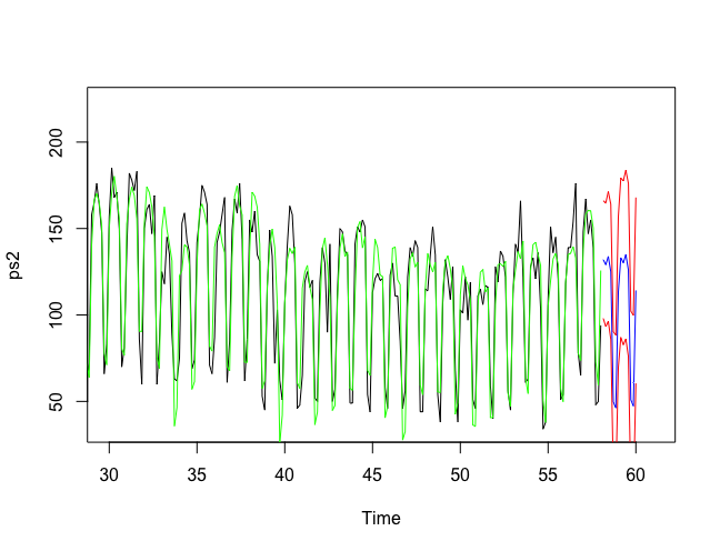
Figure 3: Prediction
In Figure 3, you can now see several lines (for better visibility, the beginning of the time series has been truncated from index 30). The black line represents our original data. The green line shows the function that the algorithm optimized on our data and that is used for the prediction. The predictions can be seen by the blue line. The two red lines also give an upper and lower bound on the possible deviation of the predicted data.
Another analysis we can perform on our data would be anomaly detection, that is, answering the question: which of the values in our time series deviate suspiciously from normal? For this we will use the AnomalyDetection library from Twitter. Details about the installation and the exact description of the algorithms used can be found on their GitHub page. We have already read in our data as a Time Series.
The analysis is possible with only one line of code:
res <- AnomalyDetectionVec(ps$docs, period=7, direction='both', plot=TRUE)
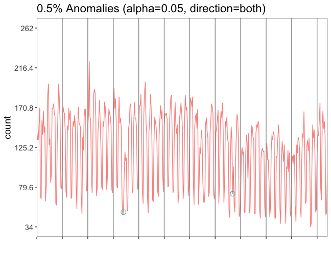
Figure 4: Anomaly detection
The variable res has two subparameters: plot and anoms. With res$plot we can generate the figure 4. There are not many anomalies on our data, everything seems to be normal. But if you look closely, you can see two small green circles marking two anomalies (in the 4th and 8th time segments). Both anomalies are in the lower part of the graph, so fewer documents were collected on those days than expected. We can use res$anoms to look at which line and value from our file it is. The check shows: It is Christmas for the first anomaly and Ascension for the second.
We have only very roughly outlined the topic of time series analysis in this article. Hopefully, the practical examples have made some of the mentioned concepts and algorithms or their application more understandable.
Footnotes: