Accessible form fields with simple means

by Dennis Westphal

Publication date

In October 2021, we checked food delivery services for their accessibility for blind people. With three of the five providers tested, as a non-sighted person I could not even order the pizza I had chosen and, if I had depended on such delivery services, I would have had to spend the evening hungry on the sofa!

Apart from the frustration that the majority of the services were not barrier-free, the conclusion is that we urgently need to talk about forms. That's where it failed.

A mere formality, such a form?

Let's take a look at the most common pitfalls in forms.

First of all, what needs to go in there in the first place?

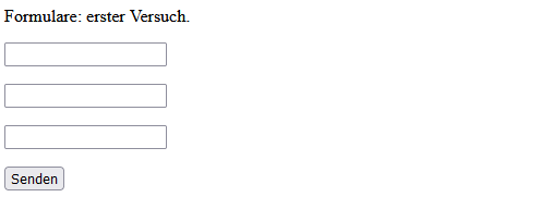
Unfortunately, there are still many forms where it is not clear what should be written in the respective fields. The only thing the screen reader reports here is: "Input field, empty". One can only guess whether the name or first name or the telephone number should be entered!

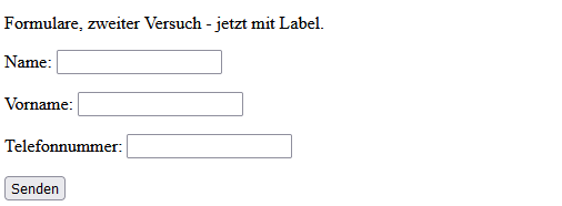
This is because labels are missing. A label tells me, as a blind user, what information is expected from me in this form field. A form field with a label could look like this in HTML, for example:

<label>Telefonnummer: <input type="text"></label>

Even though it seems to be the same issue for sighted people, it is something quite different from, for example:

<p>Telefonnummer: <input type="text"><p>

So let's do it all over again:

Great, now it's clear what belongs in which field. "Phone number, input field, empty" sounds better. But do I really have to enter the phone number? Actually, I would like to leave it out ...

And that brings us to the next problem: the labelling of mandatory fields. But this can also be done quite easily in HTML:

<label>Telefonnummer: <input type="text" required aria-required="true"></label>

Shit, typo!

Image
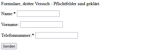
Unter der Überschrift "Formulare, dritter Versuch - Pflichtfelder sind geklärt." sind drei Formularfelder mit den Labels Name*, Vorname und Telefonnummer* und ein Senden-Button zu sehen.
Licensed under All rights reserved

Illustration of screen reader output for form fields with mandatory fields.

That already looks much better. Something can be done with "Phone number star, input field required, empty". The only thing that can keep us from having a pizza now is a missing feedback in case of an invalid entry. It happens quickly: you mistype the email address, the postcode has a number error or a letter accidentally gets into the telephone number ...

Forms catch these discrepancies and return corresponding error messages. To make them also accessible to blind users, an additional attribute is used in HTML:

<label>Telefonnummer: <input type="text" required aria-required="true" aria-invalid="true"></label>

Houston, we know the problem!

Image
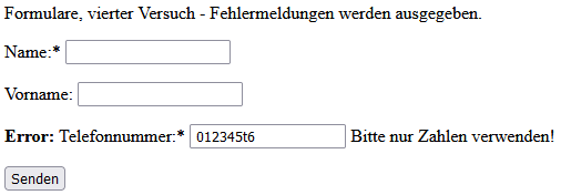
Unter der Überschrift "Formulare, vierter Versuch - Fehlermeldungen werden ausgegeben." sind drei Formularfelder, gelabelt mit Name*, Vorname und Telefonnummer*, wobei bei Telefonnummer die Fehlermeldung "Error, Bitte nur Zahlen eingeben!" und die Eingabe "012345t6" zu sehen sind, sowie ein Senden-Button.
Licensed under All rights reserved

Illustration of screen reader output for form fields with error message.

With the corresponding information on incorrect entries, this also leads to the output "Error, telephone number, input field, please use only numbers, 012345t6" for screen reader users. Much better than just a "Send" button that seems to do nothing.

Conclusion

So if you want blind people to be able to use your site without any problems and you want to get valid input from them, hopefully this article will give you a good start. Once again, it shows that it is actually only small things that make a big difference to the usability of a page with a screen reader.

Focus

Focus